
15 April 2021
After unveiling our new logo, one of the most important elements of the new visual identity, a lot of people asked us why we are doing it. Why in such a radical way? Why are we not referring to the past? Where did this idea come from and how to understand it?
The decision was not easy, because – like any such fundamental change – it involves a significant risk. Yet, there were several reasons that convinced us to it.
First of all, for a long time we wanted to organize the graphic design of our wide range of wings. So, by doing this move, we try to introduce a uniform visual identity for paragliders of various designs, while maintaining the individual character of each model. In other words, we wanted the wings to be recognizable by their visual coherence, but in the same time not to be too similar to each other. As you can see, this is a difficult proposition, requiring a lot of compromises.

And that’s not all – an additional challenge was the coming introduction of a new technical solution in the structure of the canopies, which, on the one hand, prevents further use of the existing designs, and on the other, even requires emphasizing the new visual identification (which the new logo is an important element and an integral part of). This was decisive – the previous approach to graphic design, that is the careless giving away the entire surface of the wing to a graphic designer’s imagination, will not be possible any more due to technical grounds.
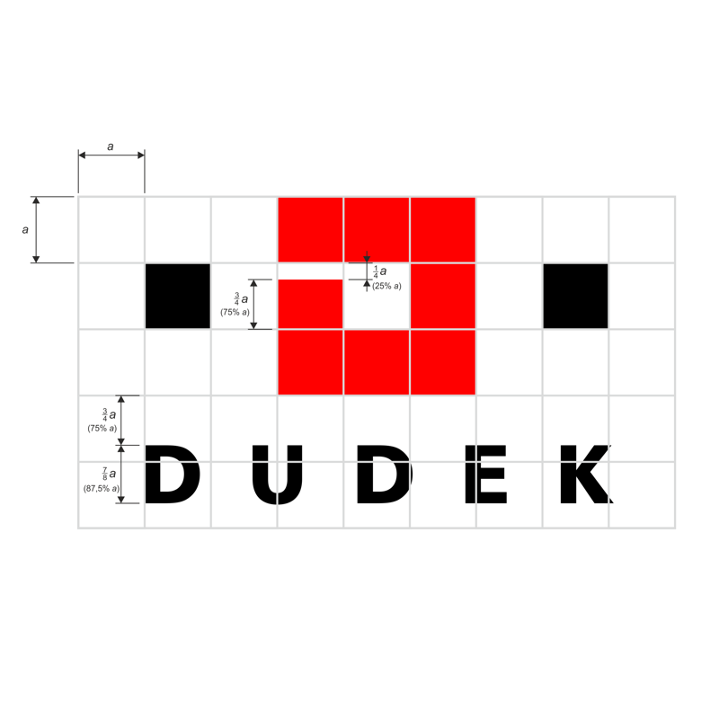
While the implementation of the requirements described above would not be easy, on top of that there was added another requirement: that of uniqueness and legibility of the new visual identification of the wings and the logo itself. The logo had to look good in a variety of colors and over a wide range of uses, from harnesses, backpacks and gadgets to the paragliders themselves.
Suffice it to say that our longtime graphic designer Włodek (the author of previous versions of the logo and most of the wing designs) had an extremely difficult task this time. However, after several months of work and many attempts, we finally all agreed that this is it!

The step towards purity and simplicity of form convinced us, but we also immediately knew that we would need a little more time to convince some of our fans to this rather radical change. Our previous logo have grown into our image over the years, along with the increase in brand recognition. Now, when it is at its widest, we change our clothes, hoping that over time they will also settle in the consciousness of the community for good, in the end being recognizable, unique, attractive and liked. And underneath them, the highest quality will be present as always..
All those interested in the nuances of creating a new company identification are invited to a, very interesting Author’s blog, (in Polish, need to be translated by Google Translator for example) where he shares his personal thoughts on the entire process.
Our new, official logo-book with all usage requirements is available here.
![]()